Background
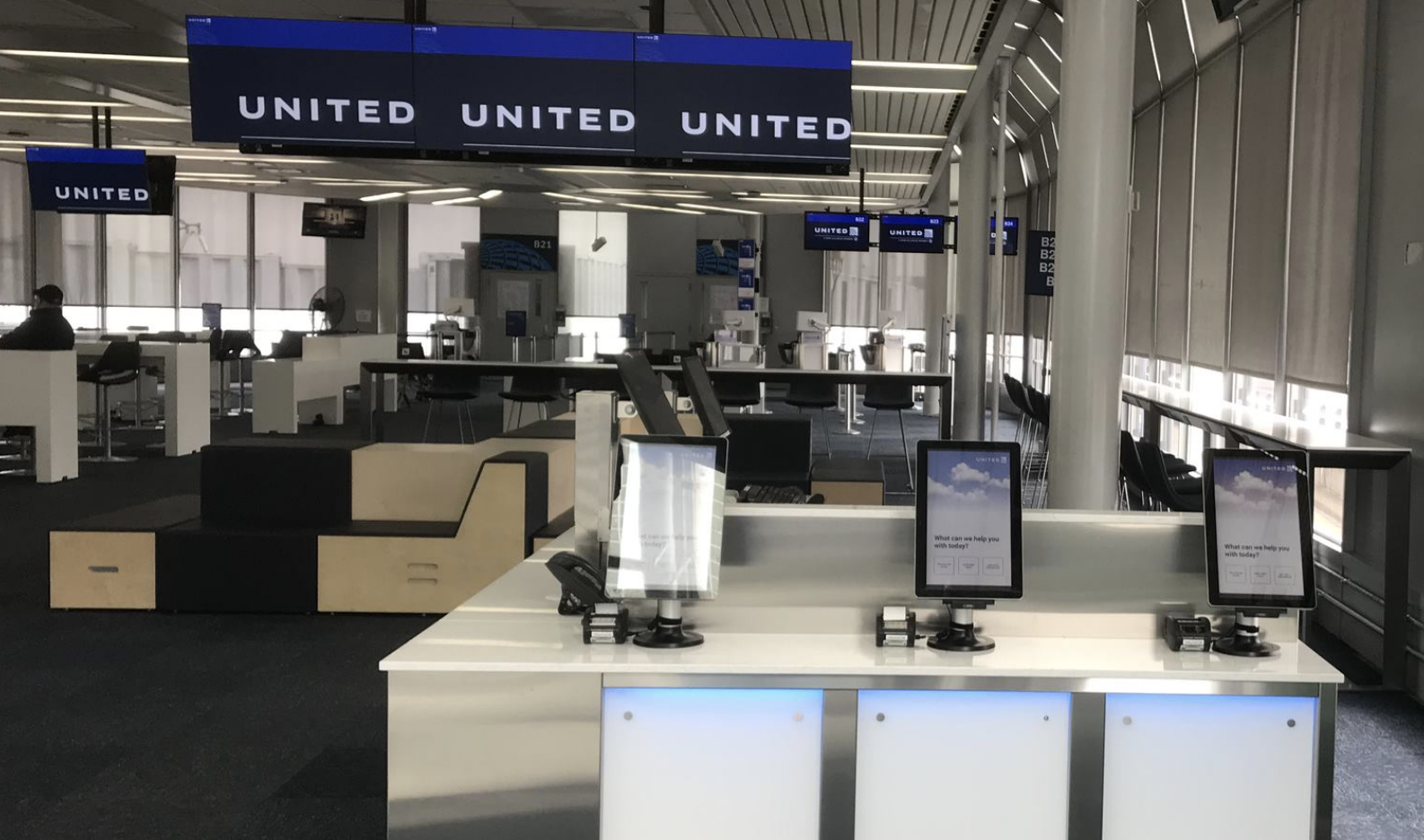
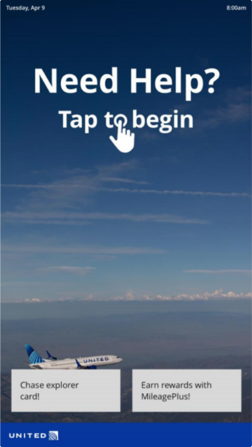
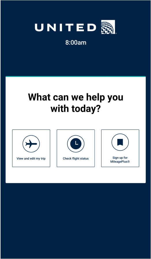
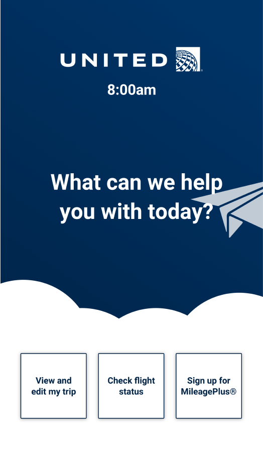
United Airlines' Check-in/FLIFO teams aimed to modernize the airport experience with self-serve kiosks that provided real-time flight updates and ability for passengers to book during delays—helping reduce bottlenecks at the gate during flight cancellations and delays. However, there were negative perceptions to kiosks. I joined the project to design a home screen that would make the kiosk feel more approachable.
Designing with a goal in mind
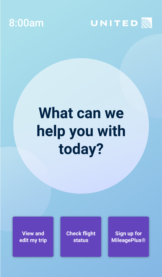
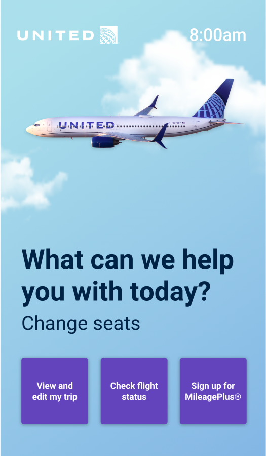
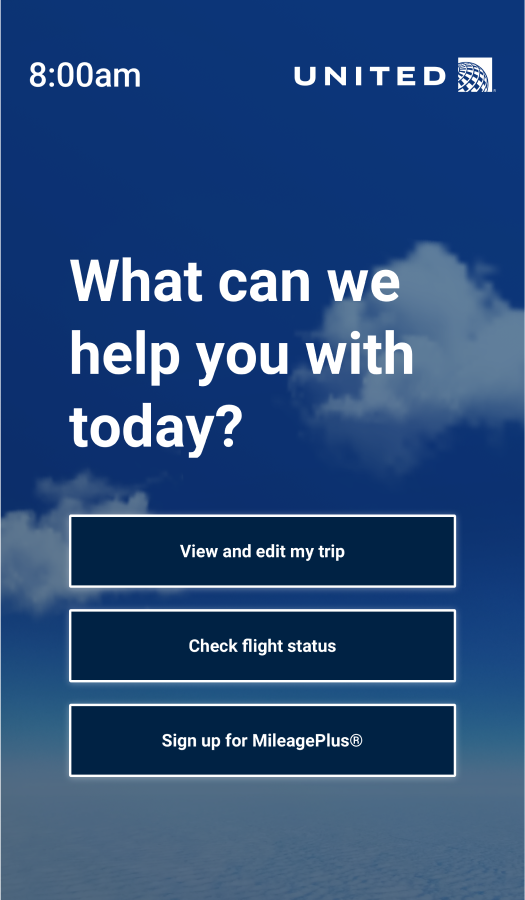
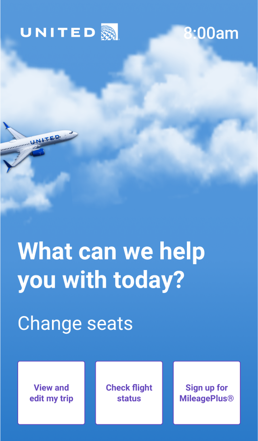
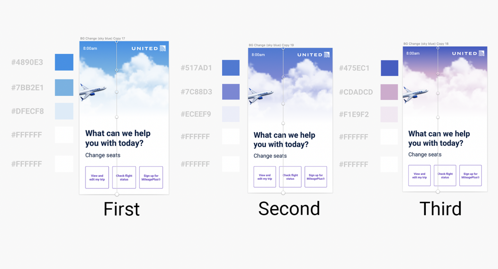
Given the wide range of possibilities, I knew I had to move quickly to make an impact on the project. I explored concepts by editing assets, extrapolating colors from brand guidelines and marketing materials, and collaging from existing research and desktop research. They aren't pretty, but the goal was to explore as many ideas as possible, from conservative to experimental.
Then, I utilized user insights from existing research and feedback from my Senior Designer. With so many options, it was important to make decisions aligned with clear goals. The work was evaluated on the these design principles.
- Design for future use - design solutions that are adaptable to different travel conditions and airport ecosystem.
- Design for empowerment - create ways for active engagement that makes passengers feel recognized and in control.
- Design contextually - limited yet specific functionalities are better than broad functionalities.
Iteration
During that evaluation, a few promising directions emerged, particularly those that could seamlessly transition to different UI states through motion and transition effects. With the growing excitement of this direction, I aligned the design to accessibility standards and it was handed off to the developer for testing.
Resolution & Reflection
My role on the project ended abruptly due to the COVID-19. However, my Senior Designer continued the work, and I was pleased to learn that the kiosk design entered beta testing at O'Hare Airport. This project was a significant learning experience that allowed me to grow as a designer.
Despite the project being cut short, I was able to collaborate with senior team members to ensure the design was user-centered and aligned with United’s brand. Refine my skills in visual design and interaction by considering both user needs and technical constraints. And adapt quickly under tight deadlines, balancing creativity with practical implementation. I left the project with a deeper understanding of how to design for real-world applications.