Getting started
Modaframing had a strong vision, so we started by comparing their ideas with existing brands. The goal was to ensure that each idea was aligned with the overall message. After this vetting process, we had a more solid understanding of what the brand was and was not.
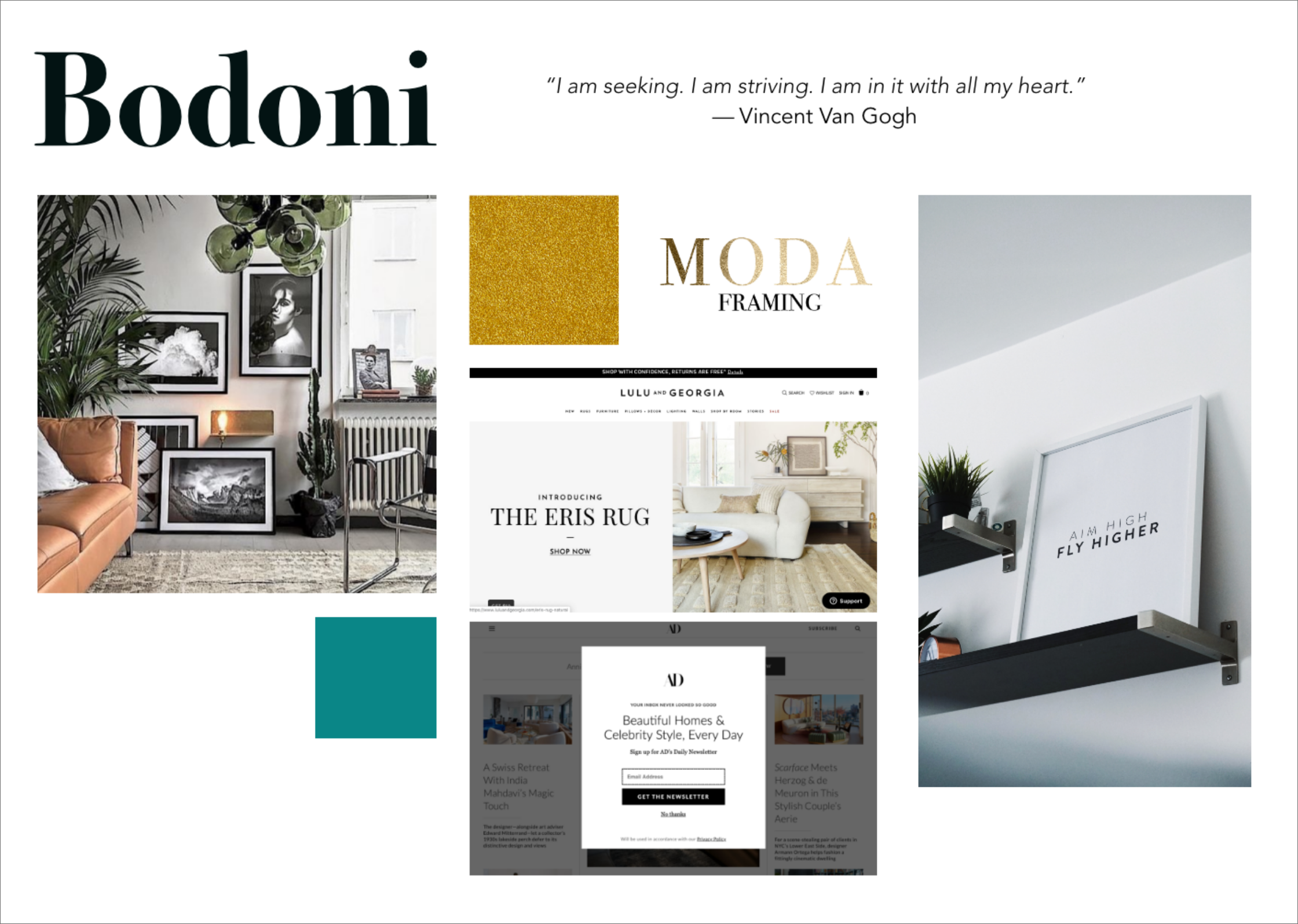
Design Exploration
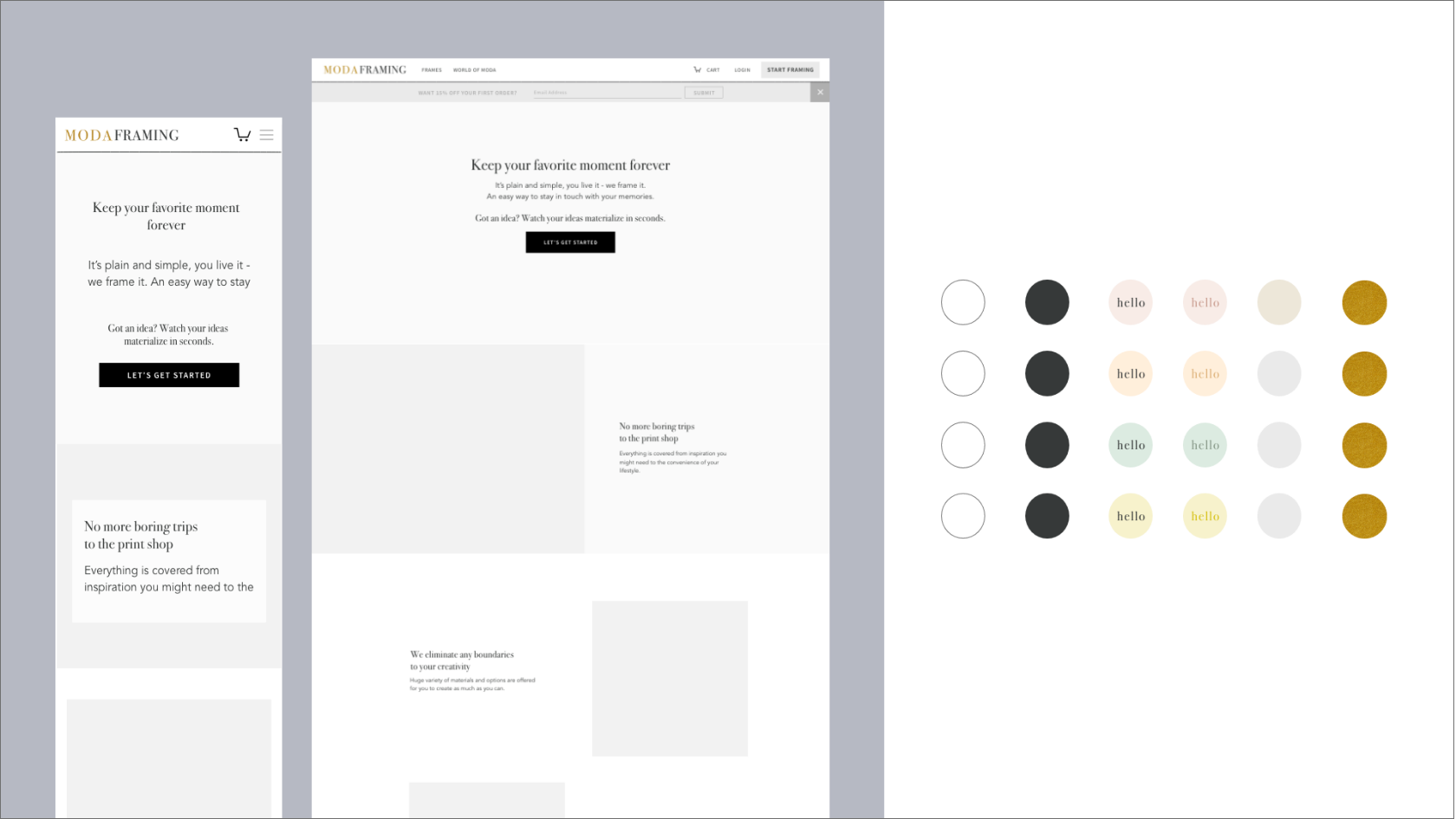
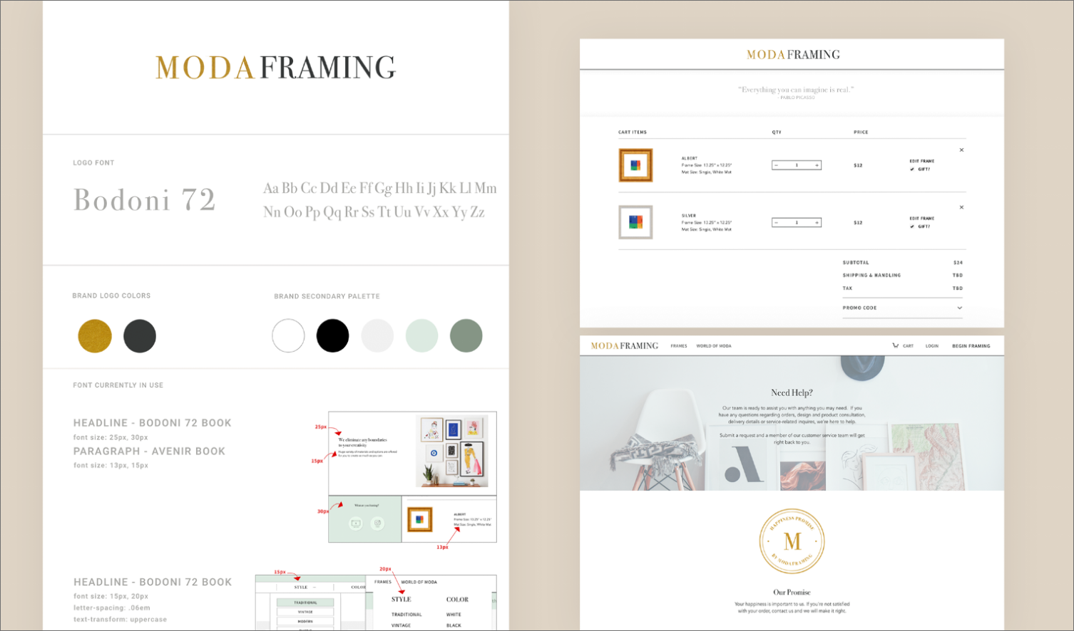
It took a few iterations to find the colors. As the colors fluctuated I worked in grayscale to develop the hierarchy and structure of the pages. The iterative process is natural and beneficial to the end product.
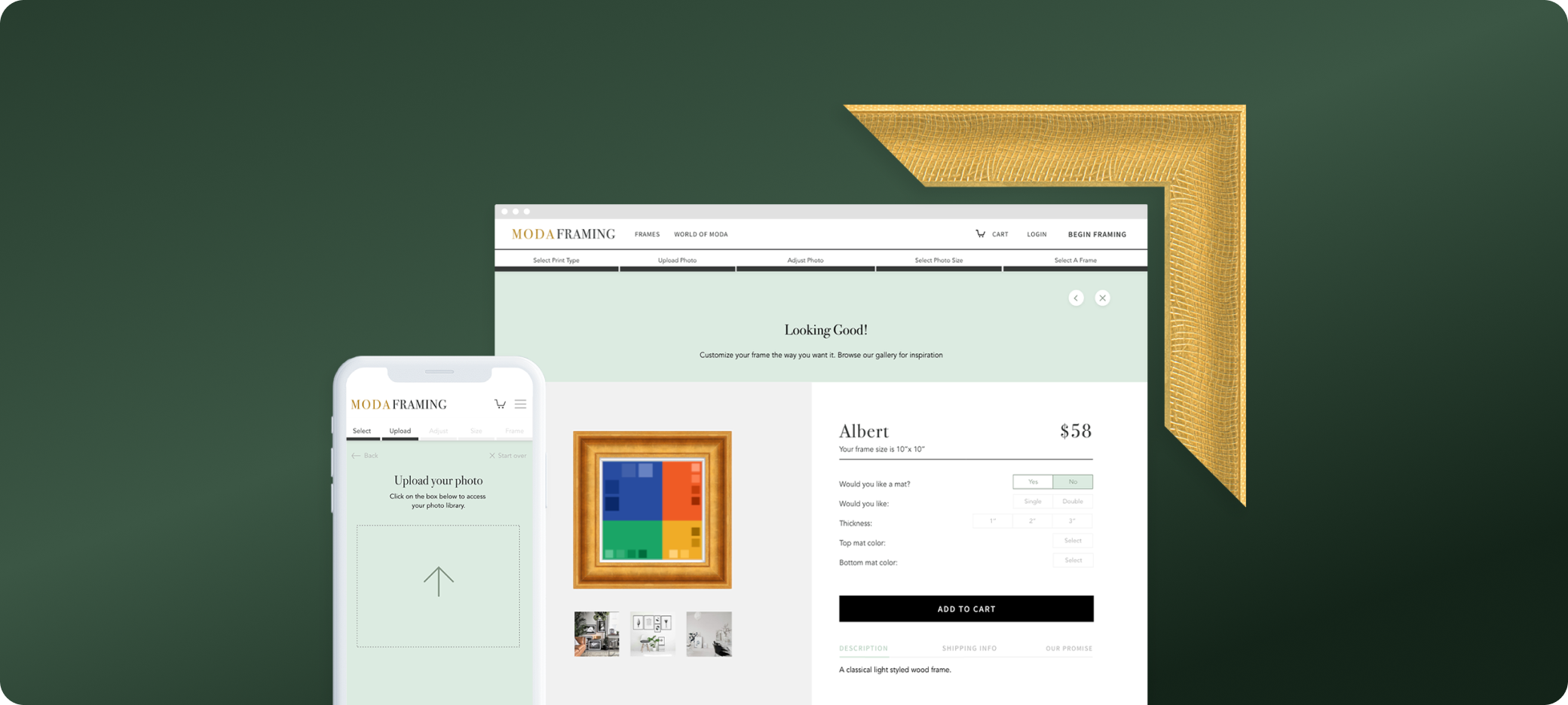
Make a custom frame
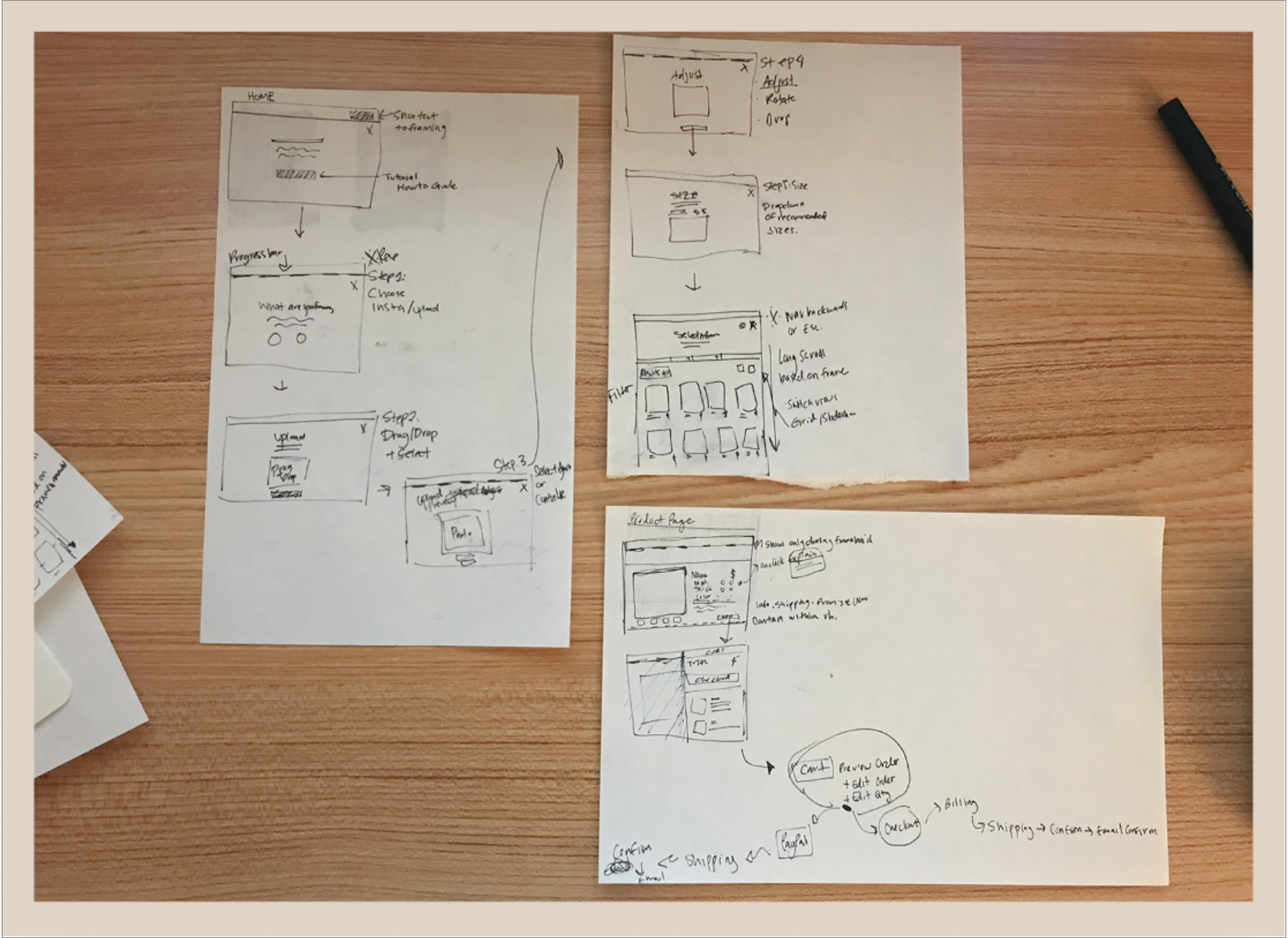
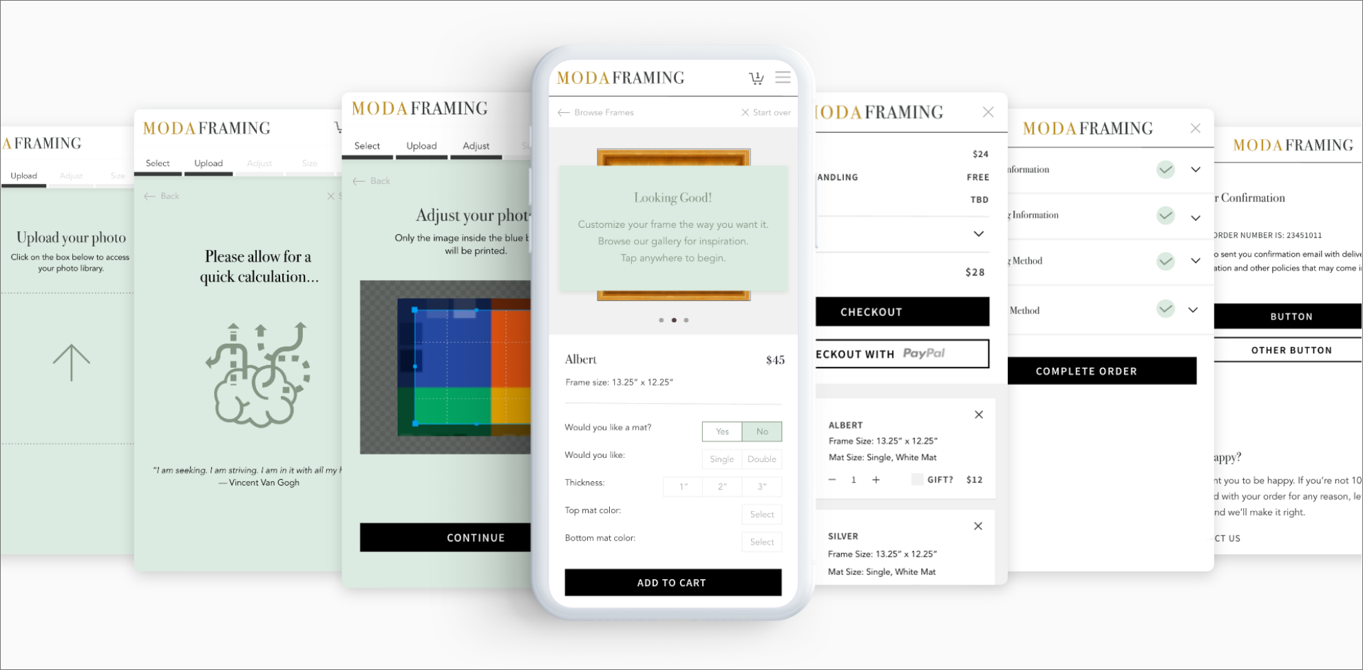
This functionality will be accessible on both mobile and desktop platforms. After performing a competitive analysis and ongoing conversations with developer and client to grasp the necessary constraints and requirements, I crafted a step-by-step user flow. For the initial MVP, we took inspiration from our own shopping behaviors, focusing on the ability to move back and forth between customization options and editing items in the shopping cart, rather than pushing directly towards the purchase process.
Launch day
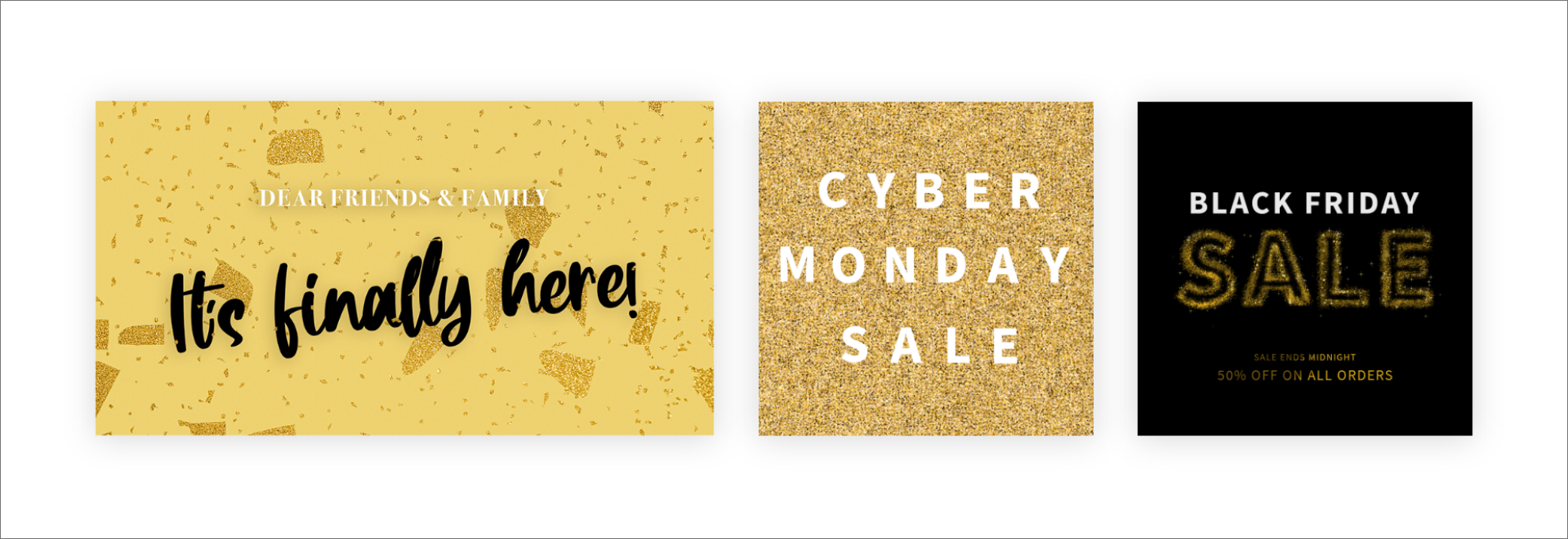
Once the site was ready to make it's debut, I created marketing assets that would be used for their first launch along with marketing materials for the upcoming holidays. This was sent out as emails to friends and family and posted on Instagram.
Final Thoughts
Even when short on time, we made sure to approach each step with thoughtfulness and intention, and that’s what made all the difference in this design.